Key Takeaways
- Primary Colors:
Red, yellow, and blue are the foundational colors that cannot be created by mixing other colors. - Secondary Colors:
Created by mixing two primary colors:- Red + Yellow = Orange
- Red + Blue = Purple
- Blue + Yellow = Green
- Tertiary Colors:
Made by mixing a primary color with a neighboring secondary color, resulting in hues like red-orange, yellow-green, and blue-violet. - Complementary Colors:
Colors located directly opposite each other on the wheel, such as red and green, which create strong contrast and vibrant visuals. - Analogous Colors:
Groups of three colors next to each other on the wheel, such as blue, blue-green, and green, which create harmonious and calming combinations. - Triadic Colors:
Three colors evenly spaced around the wheel, like red, yellow, and blue, offering balanced and dynamic combinations. - Tetradic Colors:
Four colors forming a rectangle on the wheel, made up of two complementary pairs, offering a rich and diverse palette. - Monochromatic Colors:
Variations in the lightness and saturation of a single color, resulting in a unified and soothing appearance. - Warm and Cool Colors:
Warm colors (reds, oranges, yellows) evoke energy and excitement, while cool colors (blues, greens, purples) suggest calm and serenity.
I have noticed that one of the most difficult things for beginner painters is mixing colors. This was a problem for me as well, and at times, it still is.
The trick is to get very familiar with the color wheel. Artists figure out the ideal color combinations by using color theory, which is a combination of science and art. The color theory lets artists know which colors will work together and which will not work together.
Today we are going to get to know the color wheel better. This is going to help you to know how to blend and mix colors to create amazing paintings.
Keep reading to learn more.
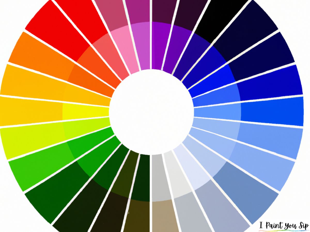
What is the Color Wheel?
The color wheel is not something new. It was invented by Sir Isaac Newton way back in 1666. He mapped out the spectrum of colors onto a circle, thus creating the basics of color theory. His color wheel, which artists still use today, shows the relationships between colors.
Color Harmony
When colors look good together, it is known as color harmony. The color wheel can be used to find the best color harmonies through the use of a variety of color combinations. These color combinations show the positions of various colors so you can find just the right colors for your art.
Two Color Wheels
There are two different color wheels. There is the RYB (red, yellow, and blue) color wheel that is used by artists. Then, there is the RGB (red, green, and blue) color wheel that is used for online purposes.
Combining Colors
Let’s take a look at the different ways of combining colors.
Complementary Colors
When two colors are opposite from one another on the color wheel, they are referred to as complementary colors. These colors will contrast with one another for a combination that has plenty of oomph. When used together these colors will be very bright and vivid.
Monochromatic Colors
When you use three or more different shades or tints of the same color, it is known as monochromatic. This subtle color combination is a great way to blend colors for an ombre look. Using monochromatic colors is a great way to bring harmony into your paintings.
Analogous Colors
When three colors are side-by-side on the color wheel, they are known as analogous colors. Using too many of these colors can be a bit overwhelming. For a good balance, use one of these colors as the dominant color, and the others as accent colors.
Triadic Colors
When three colors are evenly spaced on the color wheel, they are called triadic colors. Using these colors will give you a lot of contrast in your painting, but not as much as if you were using complementary colors.
Using triadic colors gives you a lot of versatility, not to mention color palettes that are bold and vivid.
Tetradic Colors
When there are four colors evenly spaced on the color wheel, they are called tetradic colors. These color schemes are quite bold.
It is best to use one of these colors as the dominant color and the other three as accent colors. Always keep in mind that if you have too many colors, you won’t be able to create a good balance.
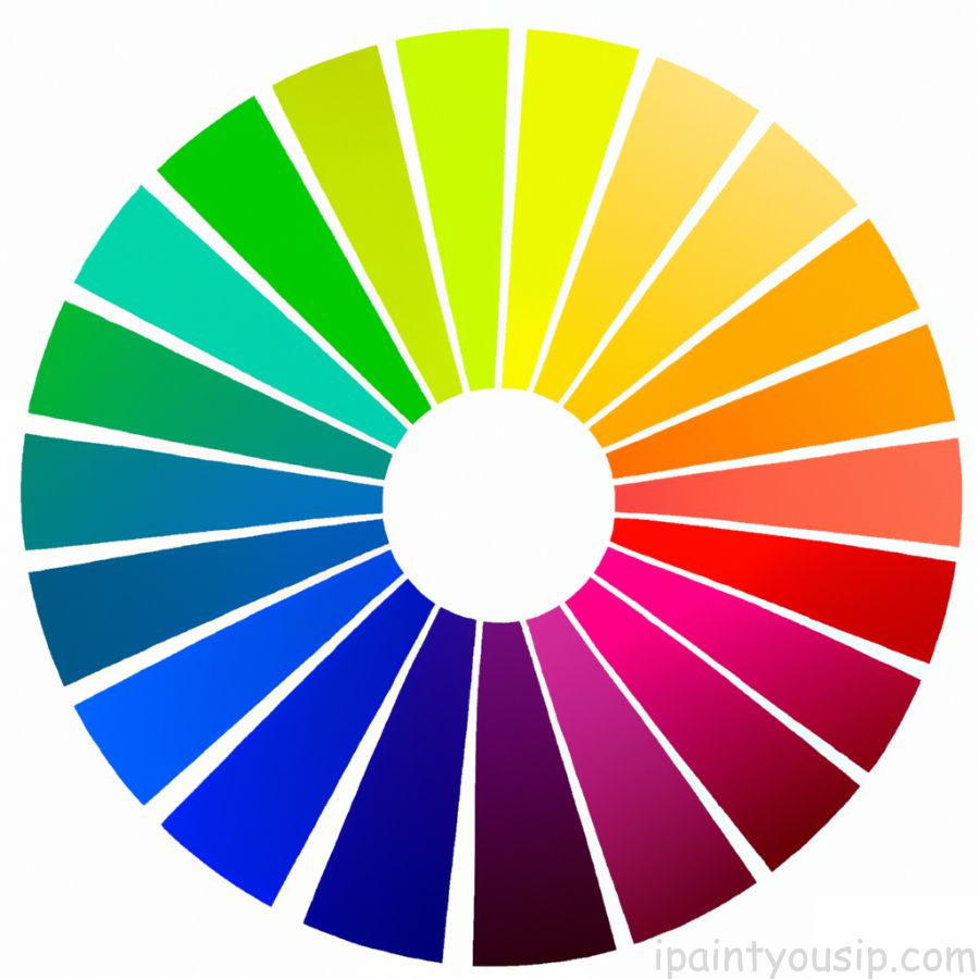
Using Primary, Secondary, and Tertiary Colors
For the sake of this article, we are only going to talk about the colors in the RYB color wheel. The wheel can be divided into primary, secondary, and tertiary colors.
Primary Colors
When using the RYB color wheel, the primary colors cannot be made from other colors. These are the colors that are used to mix other colors. The three primary colors are red, yellow, and blue.
Secondary Colors
Secondary colors are created by mixing the three primary colors. You probably remember mixing paints in grade school. Red and blue made purple. Red and yellow make orange. Yellow and blue make green.
Tertiary Colors
When you combine a secondary color with a primary color, you get a tertiary color. There are six tertiary colors in total: red-orange, yellow-orange, yellow-green, blue-green, blue-violet, and red-violet.
Understanding Warm and Cool Colors
Another way to divide the color wheel is to divide it into warm and cool colors. This is also referred to as color temperature.
You will notice that the combinations on a color wheel often show a balance of cool and warm colors. Warm colors are in the reds and yellows, while cool colors are in the blues, greens, and purples.
Learning about Shades, Tones, and Tints
You can create different shades, tones, and tints of any of the colors on the color wheel simply by adding black, grey, or white to the base color.
Shades
When you add black to the base color, you will darken that color, making it deeper and richer. This is known as adding a shade. You need to be careful with shading. While it can be dramatic, it can also be a bit too much at times.
Tones
Adding black, white, or grey to the base color is known as tinting. This will make the original colors appear more subtle, but they are still the original color. Creating tones can make things show up in the base colors that you may not have noticed previously.
Tints
When you add white to your base color, you are lightening it. This is known as adding tint. If you want colors to be less intense, adding white is a great way to soften those colors while still maintaining their integrity.
Saturation, Luminance, and Hue
Any color on the color wheel is also referred to as a hue. When using the color wheel, you can change the saturation and luminance of any hue.
If you want to make the color more intense, this is known as saturation. If you want more brightness, it is referred to as luminance.
Final Thoughts
I hope you have learned something from this introduction to the color wheel. If you don’t already have a color wheel to work with, I suggest you go out and buy one. You can even download a color wheel online so it won’t cost anything. The more you practice mixing colors from the color wheel, the easier it is going to be for you to mix and blend to create amazing paintings.
See more: Most Used Colors at Paint and Sip Parties
Sari Green is a semi-professional artist and professional writer. She has been hosting paint & sip parties for the past couple of years, and truly enjoys helping other people to create their very own masterpieces. She loves to create, and you never know what she’s going to come up with next!